Text by Franklin Melendez
I’ll admit it, I’m an architecture novice. I don’t understand the allure of a building’s hidden facades, nor am I moved by the tendril-like cracks in concrete. Sure, I can recognize a handful of names and noteworthy projects, enough to throw around at cocktail parties, but for the most part I tend to avoid the subject – especially under the scrutinizing gaze of the more experienced.
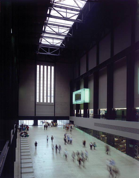
Perhaps, that’s why my encounter with the Tate Modern proved all the more remarkable as the gallery arose from its black gravel courtyards on a gloomy London morning, impassive against a steely sky. The effect was urgent and inscrutable: a solid mass of bricks mutely dominating the riverbank vista in the Southern district of Bankside. And even this initial impression did not prepare me as I descended down the central ramp, through squat doors that suddenly opened onto a massive, enclosed space, a mixture of industrial austerity, futurist design and religious awe. An ingenious reinvention of a former engine room, this turbine room was hollowed out to evoke the great European arcades, and I would later learn that it was the centerpiece of the design by Swiss architecture firm Herzog & de Meuron. But at that moment, confronted by history and innovation as a visual experience, I couldn’t help but note its sheer impact, and my attitude on the possibilities of design miraculously changed.
If not quite a revelation, the encounter inaugurated a new passion for this non-believer. And in fact, a good number of architectural converts may be the inadvertent result of the Tate’s decision to split its massive art collection in 1995. Faced with the daunting task of finding an adequate site for its contemporary work, the Tate committee settled on an unlikely choice: the Bankside Power Station. Across the Thames, opposite St. Paul’s, the dour brick building was a fossil of ’50s British industry – the type of heavy, no-nonsense approach meant to withstand even the most furious blitzkrieg. In an international competition, the committee, headed by Sir Nicolas Serota, entertained multiple possibilities before settling on the design of Herzog & de Meuron, whose model seemed to propose the least dramatic alterations to the building’s original facade. The minimalist approach offered an attractive alternative in an age of museums turned over to signature architecture, often producing dramatic sites that rival (if not overshadow) the collections they house. The simple plan made sense, a single “light beam” across the top level as the only ostensible marker – a modest touch in comparison to the twisting torques of Frank Gehry’s Guggenheim Bilbao, or the winding passageways of the Getty Center. However, the final result superceded expectations, and the building emerged a consequential landmark, setting forth a new model for museums at the millennium, heating up ongoing debates in architecture, and along the way securing the 2001 Pritzker Prize (the Nobel for architecture) for this little firm from Basel.
Founded in 1978 by two childhood friends and schoolmates, the Swiss firm built its reputation on a streamlined approach to design; avoiding postmodern pastiche, they favored Bauhaus-flavored solid boxes lightened by glazed insets. Up until the Tate Modern, they had been responsible for smaller projects, industrial and commercial sites, with an odd gallery or private residence thrown in. For their seemingly stern designs, they were aligned with early-’90s minimalism – a somewhat misapplied label that elides a more contentious relationship to reduction, functionalism and modernist austerity. Even at this stage, their projects displayed a conceptual proclivity borne from manipulating existing constraints to yield new possibilities. For instance, the ubiquitous box was in fact a cornerstone of Swiss architecture, which the duo sought to reinvent in unforeseen ways. One particular breakthrough was the 1993 Ricola Production and Storage Building, a concrete rectangle rendered fragile by a facade of translucent, screen-printed panels. Far from minimal, the effect is wonderfully complex, from the unexpected juxtaposition between the building’s severity and the light panels, to the delicate images which echo the surrounding foliage through Warholian Pop.
This infatuation with the “skins” of buildings has become a signature preoccupation for the firm. In their pioneering designs, facades function as images themselves or are “positively saturated with images” to provide an experience independent of the underlying structure. In relation to the surrounding environment, the skin forms a type of envelope that mediates between inside and outside, creating a different sense of space.
The novel perspective characterized the Tate Modern in 2000. Though the light beam appears as the main alteration – in reality an internally illuminated, double penthouse set atop the original structure – the interior of the building was entirely remade, leaving the facade precisely as a skin, a brick wrapping for a surprisingly permeable space. This fresh approach to the considerable restraints of the project also marks its legacy: a visionary negotiation of avant-garde zeal with pressing material demands. As the pair notes, “It is exciting for us to deal with existing structures because the attendant constraints demand a very different type of creative energy.” And thus, the structure with its galleries of various sizes, roughly textured floors, and colored glass partitions unfold less as a calculated solution than as an artful dialogue between new and old, innovation and tradition, art and function.
If in the ’90s the firm became mistakenly aligned with architectural minimalism, this project threatened to make them synonymous with adaptive re-use – the term for the radical transformation of existing sites for alternate purposes. However, as subsequent projects have shown, their range of work is incredibly complex and varied, perhaps only linked by the constant search for new strategies in the design process. In 2004, the Walker Art Center Expansion proved the effectiveness of their unorthodox methods as the building’s facade was developed through experiments with crumpled pieces of paper cut out to produce accidental shapes. In the apt hands of the firm, these child-like gestures yielded a shimmering, aluminum “ice cube,” whose irregular windows provide a marvelous counterpoint to the original Walker Center’s staunch, rectangular symmetry.
And then there’s the Prada Tokyo Aoyama, a masterpiece of futurist design and functionality. The peculiar form evolved from a vaguely house-like shape carved and wrapped in various materials (e.g. foam, wire, paper, foil). Finally arriving at a hexagon with a gridded surface, the team executed it in signature glazed insets and state-of-the-art fibrous polymers. The result is much more than a flashy exterior, for the latticework skin functions as an integral aspect of the structural design, supporting ceilings and walls, opening large areas for dressing rooms and display. This keen sense of detail defines every aspect of the store, punctuated by carefully thought out details, down to the fiberglass light fixtures and internally lit modular display tables. In the evenings, the jewel-like configuration glitters in the Tokyo urban-scape like a raw crystal, a dazzling apparition in a secular world.
Something of this magic permeates the recently completed de Young Museum, with its corrugated surface inspired by light filtering through leaves. The poetic copper structure rises dramatically from the park, a vague pre-Columbian echo amid the lush foliage. The open, three “fingered” design optimizes an interface with the surrounding environment, melding with the natural greenery which literally seeps in to form the building’s courtyards. The result – light years away from the self-contained box – is a porous inter-space, a new horizon for architecture, neither private nor public, which holds the possibility of infinite discovery.

The poetic copper exterior of the de Young Museum.

