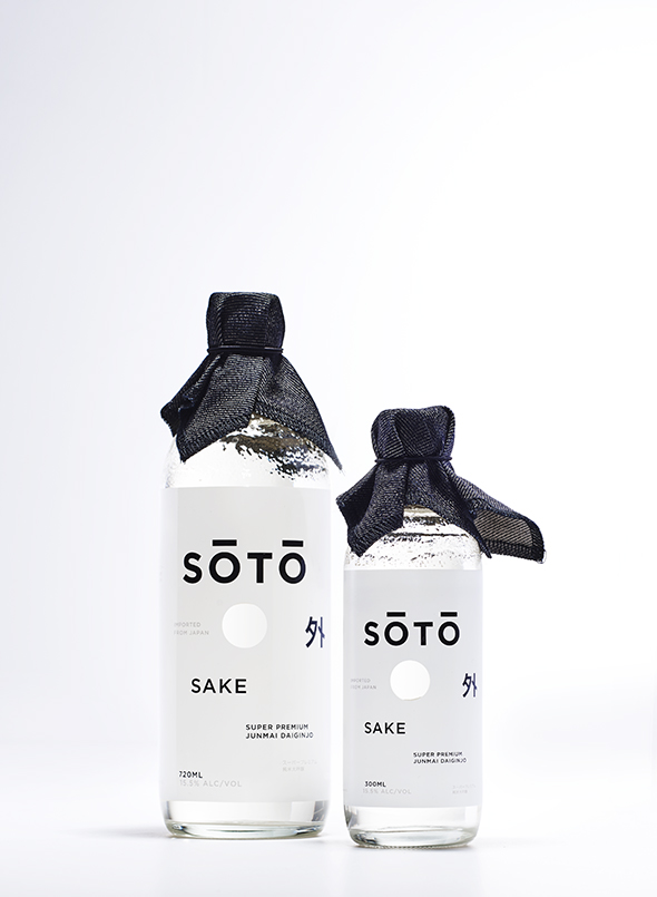
A sake bottle may not be the first thing that comes to mind when you think of beautiful design, but then again, you may not have seen this sake bottle. Designed by Joe Doucet (of JDXP) for SOTO Sake, this bottle is not just a container; it is as conceptually thoughtful as the sake inside. With its intricate innuendos and unique design, the bottle deserves a space in an art gallery just as much as it deserves to don the shelves of the chicest bars.
Conversations between Doucet and SOTO founders, Billy Melnyk and Dan Rubinoff, about the vision of SOTO Sake and its introduction to a western audience began about two years before the project took official form. Because of the idea’s long incubation period, the actual design process took mere weeks, and the bottle was presented nearly as-is at their first meeting. It was important that the bottle be completely unique and visually distinct from other sake bottles, but still read as a fine sake. It was also very important that the design maintain a connection to the history and traditions of Japanese, and specifically sake, cultures.
The SOTO Sake bottle is not simply an empty vessel, as all aspects are conceptually sound and swathed in nuanced meanings. “SOTO” in Japanese means “outside.” What the silkscreened opaque wrap around label does, quite poetically, is subvert the more obvious interpretation. The label features two holes on opposite sides of the bottle, so that one can peek through the bottle and gaze through the sake, thus viewing the outside world through the spirit. After admiring the sake through the label, one can walk down the streets of Japan, an experience translated into typography. The clean, orderly architecture against the chaotic tangle of power lines is represented by the random layout of the text set against the crisp black-and-white palate. There is no discernable structure to the typography, but there is an overall sense of balance and composure.
In Japan, sake typically has a screw cap. However, in western culture, we often associate a screw cap with lower-quality products and opt for the corked counterpart. Also, high-end sake bottles traditionally come wrapped with paper, which can be a bit wasteful, since it is immediately discarded. The elegant solution to these two issues is one piece of Japanese denim. Tied over the lid, the fabric references the time-honored paper wrapper and elevates the customary screw cap. It also adds an element of ritual to the serving of sake, since once you remove the cloth, it can be used to wipe the bottle of any excess moisture and can double as a coaster. According to Doucet, some SOTO enthusiasts even suggest it could be used as a pocket square.
JOE DOUCET x PARTNERS, or JDXP, is an award-winning practice, made up of exceptionally talented and creative people. President and Chief Creative Officer of JDXP is Joe Doucet himself, naturally. A truly interdisciplinary designer, Doucet can design a corporate identity, a child’s toy, jewelry, etc., just as easily and beautifully as a sake bottle.
SOTO Sake is an all-natural premium quality sake; a union of “finely polished rice and pristine mountain water from the Niigata Prefecture,” as stated concisely and beautifully on the SOTO sake website. The winner of several awards, this expertly crafted sake promises an elevated experience to its western drinkers.
It is fitting that such caliber of sake should find such a bottle, and the experts agree. “The design is up for several awards this year,” admits Doucet. “Fingers crossed.”
Text by Maria Wilson
Designed by Joe Doucet